16 I Love You To The Moon And Back Tattoo Ideas That Actually Hold Up Over Time
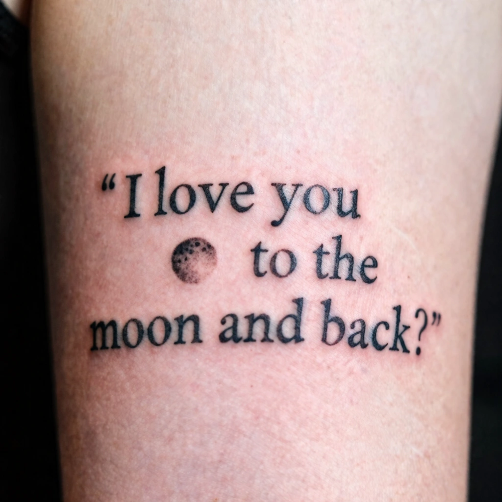
Nervous about picking a design you’ll regret in five years? You’re not alone. An “I love you to the moon and back tattoo” sounds simple on paper, but the execution — line weight, placement, size — makes the difference between a piece that ages gracefully and one that blurs into a smudge by year three.
So what are the best I love you to the moon and back tattoo ideas? Fine-line script paired with a small crescent moon works best for most first-timers, since thin linework heals cleanly on smaller placements like the wrist or ribs. Blackwork and dotwork versions suit those wanting more visual weight and better long-term contrast on skin.
Stick around, because I’m going to walk you through placement tradeoffs, realistic pain levels, how to brief your artist so you don’t end up with a muddy stencil, and what actually happens to these designs after ten years on skin.
Why This Phrase Keeps Showing Up in Tattoo Studios
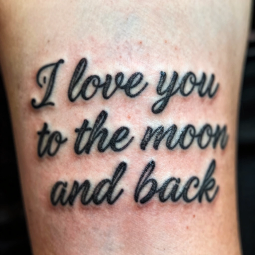
I’ve spent enough time in shops watching consultations to notice a pattern: “I love you to the moon and back” is one of the most requested sentimental phrases out there, and it’s not hard to see why. It’s short enough to fit almost anywhere on the body, it pairs naturally with celestial imagery (moons, stars, orbits), and it works for nearly any relationship — parent, partner, sibling, even a pet you lost. The category works because the phrase itself is flexible. You can go tiny and whispered with single-needle line work, or you can go bold and graphic with blackwork shading. Below are sixteen ways people are actually getting this done right now, broken down by technique, not just vibe.
1. Fine-Line Script Only

This is the most requested version, and for good reason. A fine-line tattoo uses a single thin needle to create delicate, low-saturation script that reads almost like handwriting. No shading, no thick fills — just clean, consistent line weight throughout the phrase. It works best in cursive or a simple serif font, kept under three inches wide.
Best placements are the inner forearm, collarbone, or ribs, since flatter skin holds thin lines more accurately than curved or bony areas. Healing typically runs 10–14 days for linework this size, though healing varies by individual and skin type. Bring a printed reference of the exact font — don’t just describe it verbally, since “cursive” means different things to different artists.
Pain-wise, ribs and collarbone tend to rank higher on the discomfort scale because there’s less muscle padding there. This design ages well if the artist keeps lines thin and consistent, though touch-ups every 8–10 years help maintain crispness. Next, let’s look at a version that hides the words inside the moon itself.
2. Crescent Moon With Hidden Text Inside

Instead of writing the phrase in open script, this design tucks the words inside the negative space of a crescent moon — meaning the moon’s outline is solid black or dark, and the phrase is left unshaded, showing through as the natural skin tone. It’s a clever use of negative space, a technique where the absence of ink creates the image rather than the ink itself.
This works best on the upper arm, calf, or shoulder blade where there’s enough flat surface for the moon shape to read clearly at 2–3 inches. Smaller than that, and the tiny text inside becomes unreadable once healed. Ask your artist about their experience with lettering-in-negative-space specifically — it’s a trickier technique than straight blackwork.
Pain sits moderate here since most of these placements have decent muscle coverage. This design suits people who want the phrase present but not immediately obvious, which makes it workplace-friendly. It also transitions nicely into matching-family designs, which is our next idea.
3. Matching Mother-Daughter Moon Phases

This one splits the moon’s phases — new moon, half moon, full moon — across two or three people, with the phrase divided between them or written individually beneath each phase. Typically done in bold outline style with moderate line weight, thicker than fine-line but not full blackwork.
Wrists and inner ankles are the go-to placements for matching sets since they’re easy to show off side-by-side for photos, and both areas heal in about 2 weeks with proper care. Ask your artist to draft all versions together as one stencil sheet so the moon phases stay proportional to each other, even if body size differs between family members.
Wrist skin is thinner over bone, so expect a sharper sensation than fleshier spots. This category is popular for milestone tattoos — think graduations or weddings — and it tends to age evenly since everyone’s getting the same simple shapes. Now let’s go heavier with a full blackwork treatment.
4. Blackwork Full Moon With Star Cluster

Blackwork uses solid, saturated black ink to fill large areas rather than relying on thin outlines. Here, a fully shaded moon sits surrounded by a small cluster of stars, with the phrase curving beneath in a bold serif or block font. The heavy ink saturation gives this design serious visual weight and strong contrast against most skin tones.
Because of the solid fill, this needs more space than a linework piece — think 4 inches minimum on the upper arm, thigh, or upper back. Solid black holds up better over decades than fine grey shading, which is worth mentioning to your artist if longevity matters more to you than subtlety.
Expect more discomfort here since blackwork involves repeated passes over the same skin to build saturation. This design fits people who want a statement piece rather than something quiet, and it’s a strong pick for a first tattoo if you already know you want boldness over subtlety. Next up: a much quieter, single-needle option.
5. Minimalist Single-Needle Moon Outline

Single-needle work is essentially the finest line an artist can produce — thinner than standard fine-line — used here to create just the outline of a crescent moon with the phrase in tiny lowercase letters beneath it. No fill, no shading, just a whisper-thin outline.
This is ideal for the inner wrist, behind the ear, or the side of a finger, staying under 1.5 inches total. Because the lines are so thin, healing is usually quicker to look “settled” — often within 7–10 days — though single-needle designs are more prone to fading faster than bolder work over the years.
Ask specifically for a single-needle setup rather than assuming “fine-line” automatically means this — they’re related but not identical, and needle gauge affects how the design ages. Pain is generally lower here since the passes are quick and shallow. It’s a great low-commitment option for a first tattoo. From here, let’s add some color.
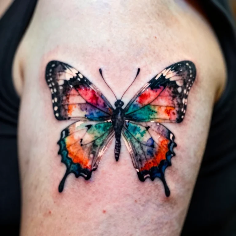
6. Watercolor Moon and Night Sky Wash

Watercolor tattoos use diluted ink application and soft color blending to mimic a painted look, often skipping bold outlines entirely. Here, a moon shape floats within a wash of blues, purples, and pinks meant to look like a night sky, with the phrase written in a clean, contrasting font layered on top.
This style needs a fair amount of space to let the color blending read properly — 3 to 5 inches is typical, on the shoulder, thigh, or upper back. Watercolor pieces are more prone to fading unevenly compared to solid blackwork, so ask your artist directly how they’ve seen their color work hold up after 5+ years before committing.
Pain level runs similar to standard shading work. This design is less workplace-neutral due to the color and size, so it suits people less concerned about visibility. It’s also a poor choice for a first tattoo if you’re worried about touch-up costs, since color fades faster than black ink. Let’s dial it back down with dotwork.
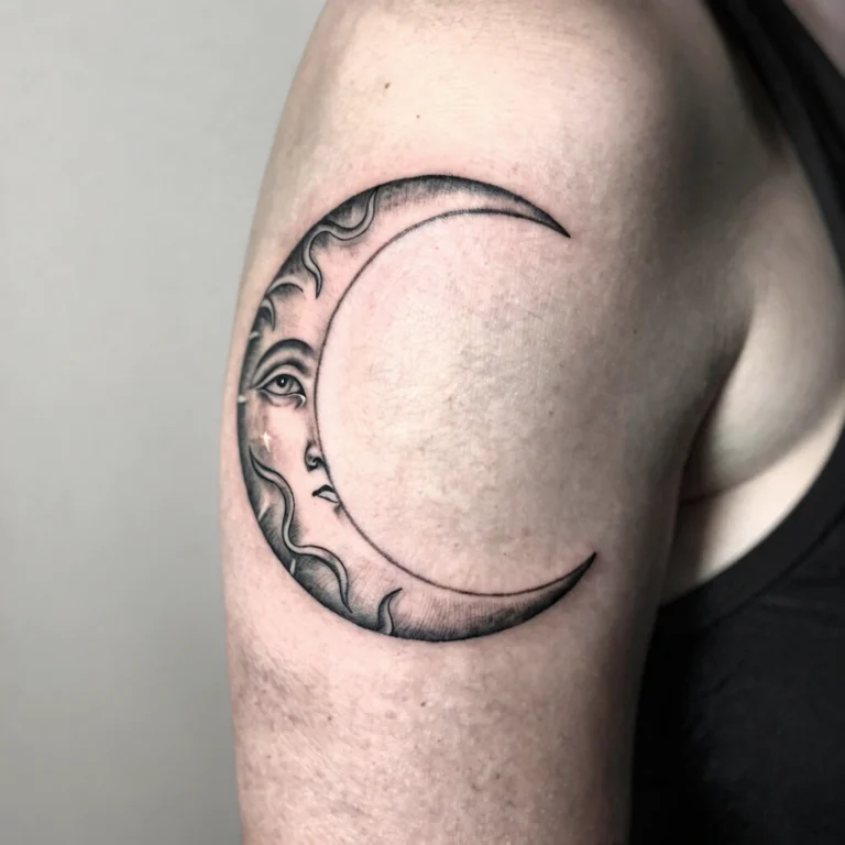
7. Dotwork Shaded Crescent Moon

Dotwork builds shading and texture using thousands of tiny individual dots rather than solid lines or fills. Here, a crescent moon is shaded entirely in dotwork, creating a soft, almost stippled gradient effect, with the phrase in simple sans-serif text beside it.
This technique rewards patience — sessions run longer than linework because of the repetitive dot placement — and works best on flatter areas like the forearm or upper back, sized around 2–4 inches. Dotwork holds detail well long-term if the dots are placed with consistent spacing, so ask to see healed photos of an artist’s dotwork specifically, not just fresh ink, since dotwork can look different once it settles.
Expect moderate to higher discomfort since the repetitive motion covers more surface area than simple lines. This design suits people who like subtle texture over flat color or bold black fill. It’s a strong choice for someone who’s already got one tattoo and wants to level up technically. Next, a technique that flips the whole approach.
8. Negative-Space Moon Design

We touched on negative space earlier, but this version leans fully into it — the entire moon is formed by leaving skin unshaded within a dark, blackwork background, essentially working in reverse. The phrase sits in the surrounding black fill in a lighter or outlined font.
This is a technically demanding piece, so placement matters — go for the shoulder, upper arm, or calf, where there’s enough room (4+ inches) for the contrast to read clearly. Because of how much solid black surrounds the design, ask your artist directly whether they’ve done reverse negative-space work before, since it requires different stencil planning than standard blackwork.
Pain tends to run on the higher end given the amount of solid black shading involved. This design is bold, memorable, and ages well since black ink saturation typically holds longer than fine detail. It’s not ideal for a first tattoo due to the commitment level, but it’s striking for someone ready for something permanent and graphic. Let’s shift to a placement-driven idea next.
9. Wrist Band Phrase Wrap

This design wraps the phrase around the wrist like a thin bracelet, often paired with a tiny moon icon breaking up the text. Line weight is kept light to medium, and the whole thing typically sits under an inch tall so it doesn’t look bulky.
Wrist placement means visibility is high, so this suits people comfortable with a very public tattoo. Healing runs about 2 weeks, and because wrist skin moves and creases a lot, ask your artist about spacing letters slightly wider than you’d think necessary — tight wrist tattoos can blur faster due to friction from watches, sleeves, and constant movement.
Pain is on the higher side here since wrist skin sits close to bone with little cushioning. This is a popular matching-tattoo placement for couples or best friends since both people can see it easily without needing a mirror. Now, let’s go somewhere much more discreet.
10. Tiny Moon Behind the Ear

A small single-needle or fine-line moon, usually under an inch, placed just behind the ear. The phrase itself often gets abbreviated here — sometimes it’s just the moon symbol with “to the moon and back” implied rather than spelled out, since space is limited.
This spot is popular for people who want a tattoo that’s easy to hide with hair but easy to reveal when they want to. Healing can be trickier here since hair products and phone use can irritate the area, so ask your artist for specific aftercare advice tailored to this placement, not just the general sheet.
Pain is often reported as sharp but brief, since the skin is thin over the skull. This is a solid first-tattoo option for someone who wants meaning without commitment to visibility. It also works well as a subtle matching design between siblings. Let’s move to a couple-focused variation next.
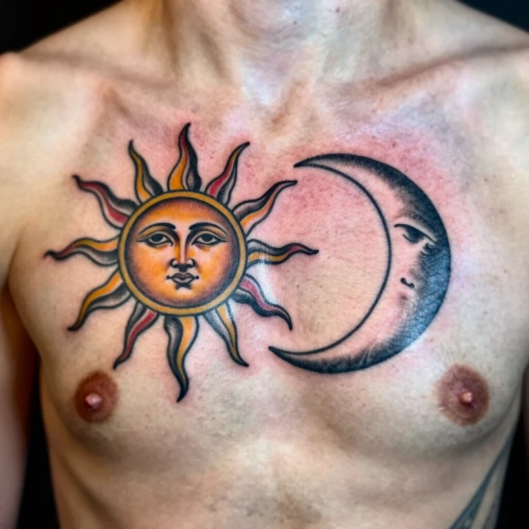
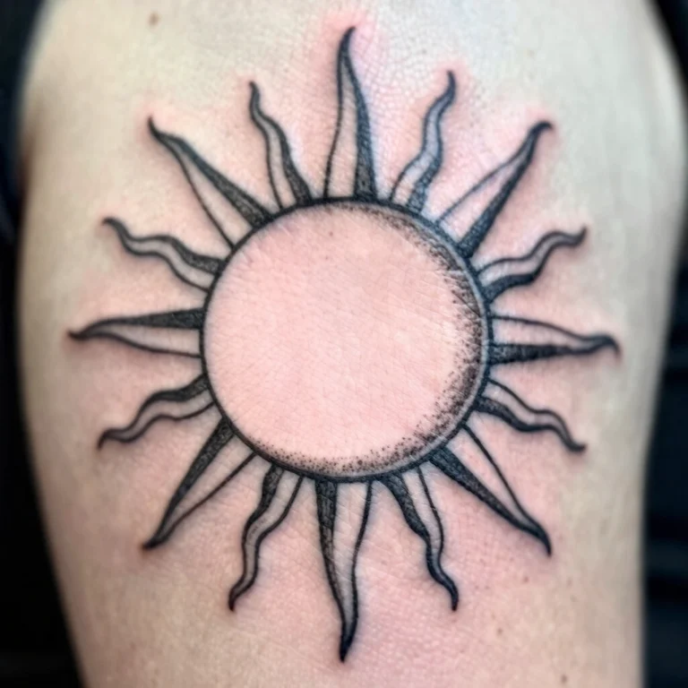
11. Matching Sun and Moon for Couples

One partner gets the moon, the other gets a sun, with “I love you to the moon and back” split between the two pieces or written in full on each. Typically done in matching bold outline style so both designs feel visually connected even though the imagery differs.
Forearms, upper arms, or shoulder blades work well here since both people need enough space (2–3 inches) for their respective symbol plus text. Bring your partner to the same consultation if possible, and ask the artist to sketch both designs on the same page so the linework style matches exactly — mismatched line weight between two “matching” tattoos is a common complaint.
Pain varies by chosen placement, so discuss options together rather than assuming you’ll pick the same spot. This design solves the desire for connection without literally getting identical tattoos, which some couples prefer. Next, let’s add some geometric structure.
12. Geometric Moon With Line Art Text

This version constructs the moon out of clean geometric shapes — think overlapping circles or angular crescent lines — paired with the phrase in a modern, minimal sans-serif font. Line weight stays consistent throughout, and there’s no shading, just precise geometric structure.
Best on flatter areas like the forearm, calf, or shoulder blade at around 2–4 inches, since geometric precision needs a stable surface to avoid visual distortion. Ask your artist if they use a ruler or geometric tattoo tools for straight lines and symmetry — this matters more here than in freehand styles.
Pain is fairly standard for linework, moderate depending on placement. This design suits people who like clean, modern aesthetics over romantic or soft imagery, and it holds up well over time since simple lines age better than fine shading. It’s also easy to personalize by swapping the moon shape for other geometric icons. Let’s go bolder and more traditional next.
13. Traditional Bold Moon and Stars
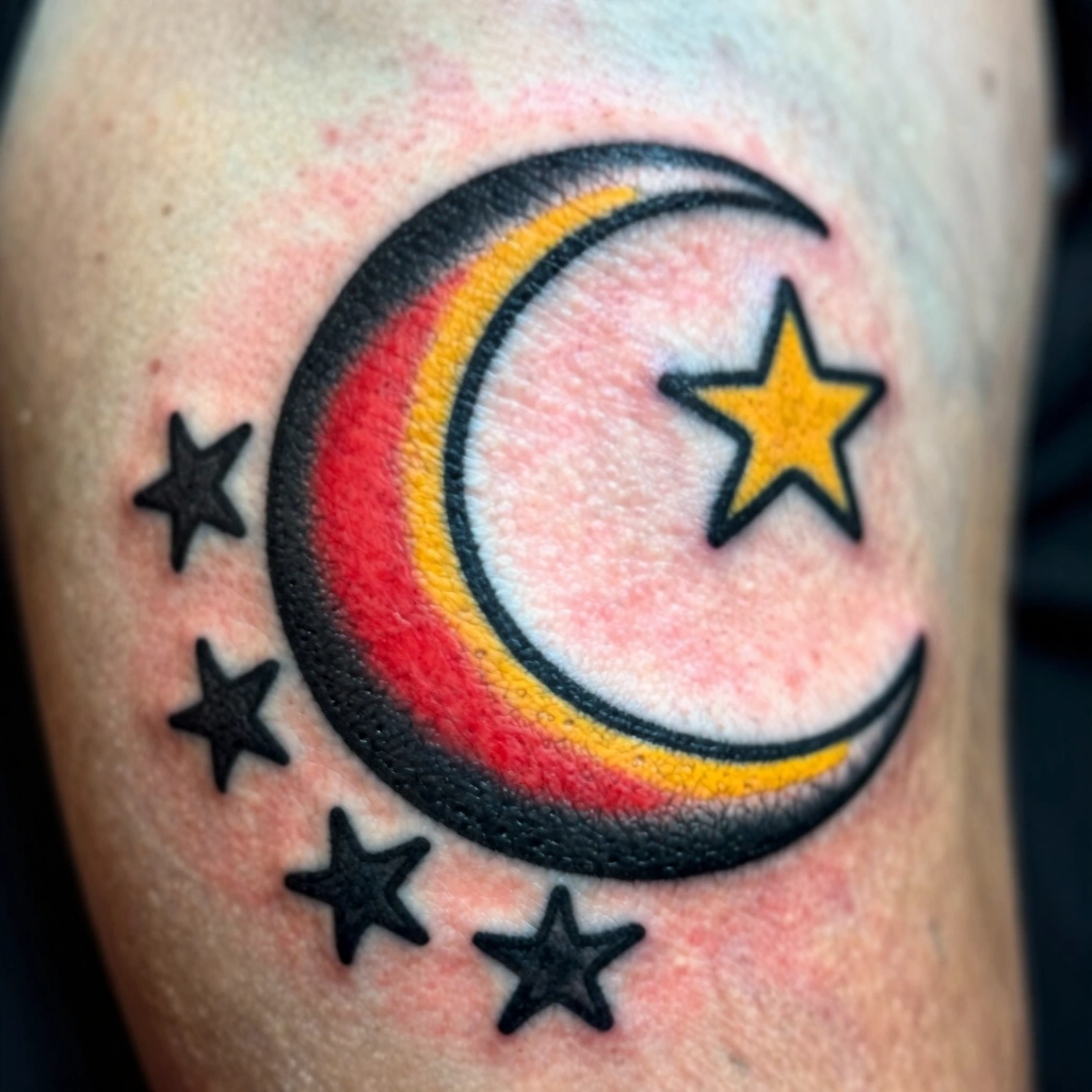
Old-school American traditional style uses thick black outlines, limited but saturated color (often just red, yellow, or green), and minimal shading. Here, a bold moon face with stars sits above the phrase in blocky traditional lettering.
This needs real space — 4+ inches — on the upper arm, thigh, or back, since traditional style doesn’t translate well at small sizes; the bold lines need room to breathe. Ask to see an artist’s healed traditional work specifically, since this style is known for aging exceptionally well when done with proper line weight and color saturation.
Expect more discomfort due to the heavier shading and color work involved. This design is a strong pick for someone who wants a design that’ll still look sharp in 20 years, since traditional tattoos are built for longevity by design. It’s less subtle, so consider workplace visibility before booking. Now, let’s connect the moon to the stars literally.
14. Moon Phases Constellation Arc

This design arranges several moon phases in a curved arc, almost like a constellation, with the phrase written along the curve. Line weight is usually fine to medium, with minimal or no shading to keep the phases clean and distinguishable.
This works especially well on the spine, ribcage, or forearm where a natural curve exists to follow. Sizing runs 3–5 inches depending on how many phases you include. Bring a reference showing the exact number of moon phases you want — five or eight phases look very different once spaced along a curve, and this affects total size needed.
Rib placement ranks among the more painful spots due to thin skin over bone. This design suits people who like the idea of time or cycles alongside the sentiment, adding a layer of meaning beyond the phrase alone. Let’s personalize things further with coordinates next.
15. Personalized Moon With Coordinates

This variation adds meaningful coordinates — a birthplace, a meeting spot — in small text beneath the moon and phrase, usually in a delicate serif or typewriter-style font to distinguish it from the main script.
Inner forearm or ribs work well here since there’s enough horizontal space for the coordinate string without needing to shrink the main text. Double-check every number with your artist before the stencil goes on skin — coordinate typos are a real and permanent risk with this kind of personalized text.
Pain follows placement norms already mentioned above. This design adds a private layer of meaning that only you and select people will understand, which appeals to those wanting symbolism without an obvious explanation. It also works well as a memorial piece. Finally, let’s look at a more playful combo.
16. Moon and Rocket Symbol Combo

A small rocket or shooting star trailing toward the moon visually represents “to the moon and back” without needing the literal phrase spelled out at all — or with just “I love you” written separately. Typically done in fine-line or light blackwork, keeping the rocket simple and iconic rather than detailed.
This works well small — under 2 inches — on the ankle, wrist, or behind the ear. Ask your artist to keep the rocket’s linework slightly thicker than the moon’s outline so the two elements don’t visually blend together once healed.
Pain depends entirely on chosen placement. This design is playful and less overtly sentimental-looking at a glance, which some people prefer for a subtler nod to the phrase’s meaning. It’s a fun matching option for parent-child pairs too.
Best Placement Ideas

- Wrist — high visibility, moderate-to-higher pain, needs upkeep due to friction from clothing and watches
- Behind the ear — easy to hide or reveal, thin skin means sharper sensation, needs careful aftercare near hairline
- Ribs — great for larger designs, ranks among more painful spots, low visibility for workplace settings
- Forearm — flexible sizing options, moderate pain, good healing surface due to flat skin
- Shoulder blade — good for larger blackwork or geometric pieces, moderate pain, easy to cover for work
- Ankle — subtle and easy to hide with socks, moderate pain, slower healing due to lower circulation in some individuals
- Collarbone — visually elegant for script, higher pain due to bone proximity, moderate visibility
Tips for Success

Choosing the right artist matters more than choosing the “perfect” design. Look through portfolios for consistency — not just one great photo, but multiple examples of the same style done well repeatedly. If you want fine-line work, find an artist whose fine-line portfolio shows even saturation and steady line weight across several pieces, not just their single best shot.
Bring reference images, not vague descriptions. A photo of the font you like, a photo of moon shapes you’re drawn to, even a rough sketch — all of this helps translate your idea into an accurate stencil. Ask direct questions during your consultation: What needle size do you use for fine-line? How do you expect this to age on my skin tone? Have you done this exact technique before? A confident, experienced artist will answer clearly without getting defensive.
Also ask about walk-in versus custom booking. Flash designs (pre-drawn, ready-to-go pieces) are faster and cheaper, while custom designs take longer but fit your exact vision. For a meaningful phrase like this one, custom is usually worth the wait.
Common Mistakes and How to Avoid Them
- Going too small for detailed designs — fine text and small shading details often blur together once healed; ask your artist if your chosen size can actually support the detail you want
- Picking a painful placement for a design that needs stillness — ribs and joints move or flex, which can affect linework precision during the session
- Skipping aftercare instructions — even simple designs can look uneven if not cared for properly in the first few weeks
- Copying a design exactly from Pinterest — small personal touches (a specific coordinate, a slightly different font, an added star) keep the piece meaningful and less generic
- Not asking about touch-ups — most tattoos, especially fine-line and color work, benefit from a touch-up session within the first year; ask if this is included in your quote
Similar Variations

Nearly every idea above can be resized up or down depending on commitment level — a full blackwork moon can shrink to a simple single-needle outline, and a tiny wrist phrase can expand into a full forearm piece with added stars or coordinates. Color can be added to typically black-and-grey designs (like the dotwork or geometric versions) for a softer, more personal look, though this usually increases cost and touch-up frequency. Combining elements works well too — pairing the hidden-text negative space technique with a constellation arc, for example, creates something more unique than either alone.
Aftercare Basics

Every artist should send you home with a specific aftercare sheet, and that’s the one you should follow closely — general advice here is just a baseline. Typically, keep the area clean, avoid soaking it in water for the first couple of weeks, avoid direct sun exposure while healing, and don’t pick at any peeling skin. Healing time varies by individual and by design size and placement, but most people see full surface healing within 2 to 3 weeks. If you notice anything unusual during healing, it’s best to consult your artist or a licensed dermatologist rather than guessing.
Quick FAQ
How much does an “I love you to the moon and back” tattoo cost?
Prices vary widely by size, technique, and studio location, but simple fine-line versions often start around $80–$150, while larger blackwork or color pieces can run $300 or more. Always get a quote directly from your chosen artist.
Does this tattoo hurt a lot?
Pain varies by individual and by placement — bony areas like the wrist, ribs, and collarbone tend to feel sharper than fleshier spots like the upper arm or thigh. Most people describe the discomfort as tolerable and brief.
How long does healing take?
Most designs at this size heal on the surface within 2 to 3 weeks, though full healing underneath can take longer. This varies by individual, so following your artist’s aftercare sheet closely matters more than the calendar date.
Will this design still look good in 10 years?
Bold, solid linework and blackwork tend to hold up better long-term than very thin fine-line or fine shading, which can soften or fade faster. A touch-up every several years helps most designs stay sharp regardless of style.
Final Thoughts

Sixteen ideas, one shared phrase — and honestly, the “best” version really just depends on how loud or quiet you want this sentiment to sit on your skin. Whether you go with a whisper-thin single-needle moon behind your ear or a bold blackwork piece across your shoulder, the technique and placement matter just as much as the words themselves.
Take your time picking an artist who’s shown real skill in the specific style you want, ask direct questions before booking, and remember that pain and healing genuinely vary person to person — a licensed professional can walk you through what to expect for your specific skin and design. Once you’ve done that homework, your I love you to the moon and back tattoo should turn out exactly like it looked in your head, and hold up well for years to come.