15 Bicep Tattoo Men Should Actually Consider Before Booking
Nervous about picking a bicep tattoo you’ll regret in five years? You’re not alone, and honestly, that worry is a good sign — it means you’re taking this seriously instead of just picking the first cool image you see on Instagram. I’ve spent enough time hanging around tattoo studios, talking to artists, and watching healing timelines play out to know that the best bicep tattoo men can get isn’t the flashiest one. It’s the one that fits the arm’s shape, the guy’s skin, and his actual lifestyle.
So what are the best bicep tattoo ideas for men? Bold blackwork bands, fine-line geometric patterns, dotwork mandalas, and neo-traditional animal or symbolic pieces tend to work best on the bicep because the muscle’s curve suits wraparound designs, and moderate-to-thick line weight holds up better on this flexing, sun-exposed area over time.
Stick around, because I’m going to walk you through fifteen specific design directions, plus placement tradeoffs, pain expectations, healing time, how to brief your artist, and the mistakes I see guys make constantly when they rush this decision.
Why the Bicep Works So Well for Tattoos
The bicep is one of the more forgiving canvases on the body. It’s got enough flat, fleshy surface area for detailed work, but it also curves, which means wraparound bands and circular compositions actually look intentional instead of stretched. Because it’s covered easily by a sleeve for work settings but shown off just as easily at the gym or beach, it’s a placement that gives you control. It’s also relatively low on the pain scale compared to bony spots like the ribs or elbow, since there’s muscle and some fat padding between skin and bone — though pain tolerance is different for everyone, so treat that as a general guideline, not a guarantee.
1. Fine-Line Tribal-Inspired Band
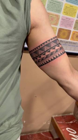
Fine-line tribal bands use thin, single-needle strokes to recreate the flowing, angular patterns associated with tribal tattooing, but without the heavy black saturation of traditional tribal work. The line weight usually sits under 0.5mm, giving the design a lighter, almost etched look rather than a solid block of ink. This works great wrapped around the upper bicep circumference, sized between 3 and 5 inches wide. Bring a reference photo and ask your artist about single-needle configurations, since that affects how crisp the curves stay after healing. Expect mild-to-moderate discomfort on the outer arm, less on the inner bicep where skin is thinner but nerve density is different. It’s a solid first-tattoo option because it’s visible but not overwhelming, and it ages fairly well if line spacing isn’t too tight. From here, if you want something with more visual weight, bold blackwork is the natural next step.
2. Bold Blackwork Sleeve Wrap
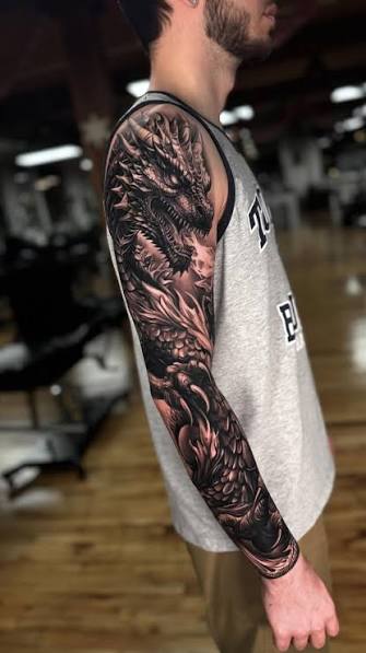
Blackwork uses saturated, solid black ink applied in thick sections rather than fine outlines, and a bicep wrap version circles the entire arm in one continuous band of pattern or imagery. This style holds up exceptionally well over decades because solid black fades more evenly than fine detail. Ideal size runs 4 to 6 inches, covering a good portion of the upper arm. Ask your artist about “packing” technique — how they layer ink to avoid patchy saturation — since that’s the difference between a clean blackwork band and a blotchy one ten years out. Pain tends to run moderate-to-high here because of the extended sitting time needed to fill solid areas. This isn’t the most subtle choice for office settings, but it reads as intentional and bold for guys who want visible commitment. Next, let’s talk about a technique that trades solid black for texture.
3. Dotwork Mandala Circle
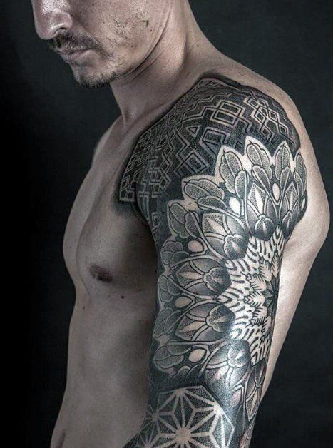
Dotwork builds an image using thousands of individual small dots instead of continuous lines, creating gradients and texture through density rather than shading. A mandala — a symmetrical, circular pattern — translates beautifully to the bicep because the muscle’s round shape mirrors the design’s geometry. A 3 to 4 inch circle centered on the outer bicep is a common, well-proportioned choice. Tell your artist you want “stippling” for shadow transitions rather than solid fill, since that keeps the texture consistent. Pain-wise, dotwork tends to feel similar to fine line but the session runs longer due to the sheer number of dots placed. It’s a strong pick for guys wanting something symbolic or meditative-looking without going fully bold. It also works well for small matching-tattoo groups since the pattern can be simplified or expanded. Now, if words matter more to you than patterns, here’s a script-based alternative.
4. Single-Needle Script Quote
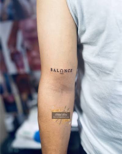
Single-needle tattoos use the thinnest available needle configuration, producing extremely delicate, almost handwritten-looking lines — ideal for a short quote, name, or date running vertically down the bicep. Keep the text under 4 inches to avoid letters blurring together as the tattoo settles into skin over years. Bring a printed version of the exact font and spacing you want; script tattoos are unforgiving if letters are miscalculated. Discomfort is generally lower here since it’s quick work, though thin lines can feel “scratchier” to some people. This is a workplace-friendly option since it reads as personal rather than decorative, and it’s a common first tattoo for guys wanting meaning over imagery. If script feels too plain, negative space design adds a modern twist.
5. Negative Space Geometric Band
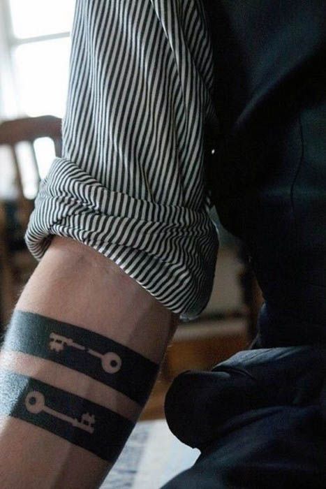
Negative space tattooing uses the untouched, natural skin tone as part of the image rather than filling every area with ink — think a geometric band where gaps form the pattern instead of solid lines. This creates a striking optical effect on the bicep’s curve, especially at 3 to 5 inches wide. Ask your artist specifically about contrast planning, since negative space depends on precise black placement to make the “empty” sections pop. Pain is comparable to standard linework, but touch-ups may be needed sooner since negative space edges can blur faster than filled designs. This suits guys who want something modern and geometric rather than symbolic. It also transitions nicely into bolder traditional styles, which brings us to the eagle.
6. Traditional Bold Eagle
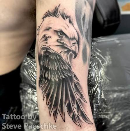
American traditional tattooing uses thick, confident outlines, limited but saturated color (usually red, yellow, green, black), and minimal shading gradients — a bold eagle design is a classic bicep choice because the wingspan fits the arm’s width naturally. Size typically runs 4 to 6 inches. When briefing your artist, specify “bold traditional linework” so they know to keep outlines thick rather than fine, which is what makes this style age well over 15-plus years. Expect moderate pain due to color saturation passes. This design reads clearly from a distance, making it less office-subtle but a strong statement piece. It also works well combined with banners or script beneath it. For something with more shadow depth, realism is the next category worth understanding.
7. Realistic Portrait Shading
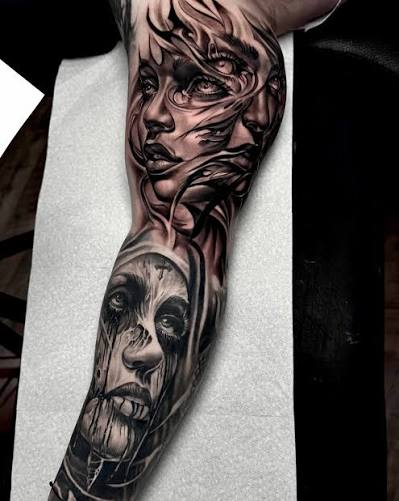
Realism tattoos rely on smooth gradient shading, often using a mix of needle groupings to mimic soft transitions like you’d see in a photograph. A portrait or realistic animal piece on the bicep needs a fairly flat surface, so ask your artist about placement on the outer arm versus the curved edge, since shading distorts less on flatter skin. Minimum size for facial detail to hold up is around 4 inches. This style takes longer sessions and tends to rank higher on the pain scale due to shading passes covering large areas repeatedly. Realism is not typically a first-tattoo recommendation because of the skill level and cost involved, and it demands a specialist with a strong shading portfolio. Once healed, expect a touch-up appointment within a year to correct any patchy fading. Moving to something graphically bolder, let’s look at Japanese-style blackwork.
8. Japanese Hanya Mask Blackwork
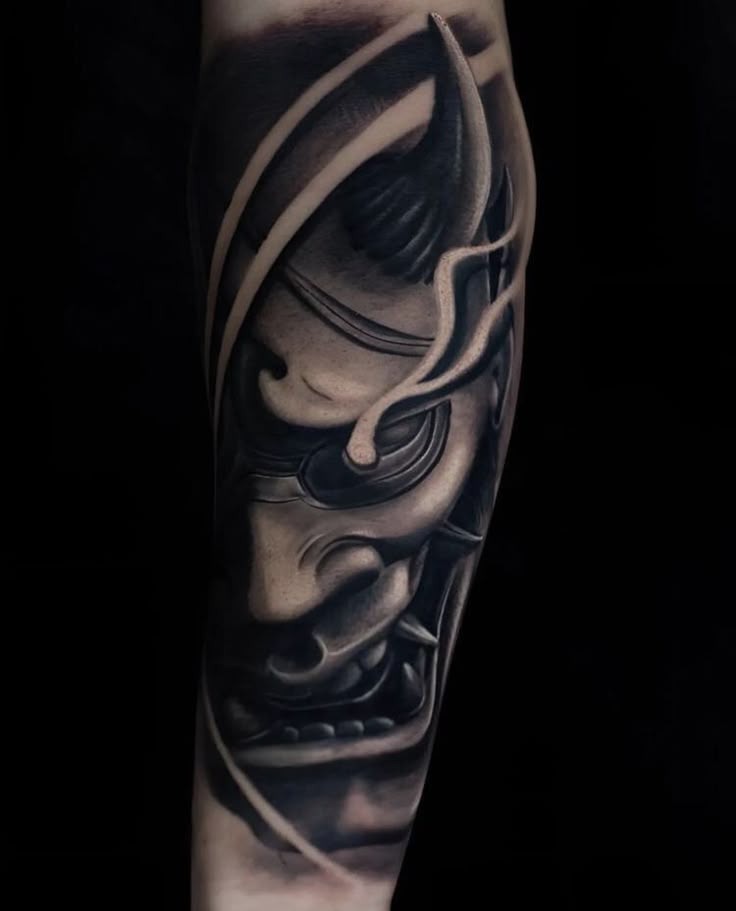
The hanya mask, a traditional Japanese image representing a jealous or vengeful spirit, is typically rendered in bold blackwork with selective red or color accents for the eyes. Thick outlines combined with heavy shading give it dramatic visual weight, and it suits the bicep’s rounded shape when angled diagonally across the muscle. A good size range is 4 to 5 inches to preserve facial detail. Ask your artist whether they specialize in Japanese traditional (irezumi-influenced) work, since proportion and expression are technical skills specific to this style. Pain runs moderate-to-high given the shading density. It’s a bold, visible choice — not ideal for conservative workplaces — but it ages well thanks to the thick linework. If bold imagery isn’t your thing, minimalist silhouettes offer a quieter alternative.
9. Minimalist Line Animal Silhouette

Minimalist tattoos use simple, unbroken outlines with no shading or color, focusing on recognizable silhouette shapes like a wolf, bird, or mountain range. On the bicep, a 2 to 3 inch silhouette placed on the outer arm reads clean and understated. Bring a simple black-and-white reference image, and ask your artist to avoid overly thin lines if you want the design to stay sharp for over a decade, since ultra-fine lines blur faster on areas exposed to sun and gym friction. Pain is generally low given the short session time. This is a great first-tattoo pick and works well for matching designs among friends or family. It’s also office-appropriate since it’s small and simple. Next, let’s cover a style that intentionally looks less structured.
10. Watercolor-Style Splash Accent
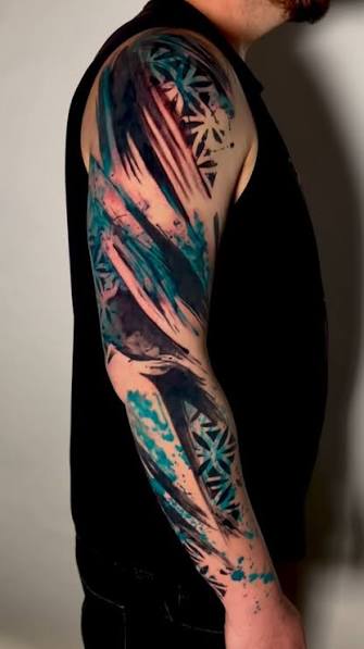
Watercolor tattoos mimic paint bleeding and splashing using soft color gradients without the bold black outlines typical of traditional work. On the bicep, this style often pairs a small blackwork subject (like a bird or feather) with a colorful “splash” background. Because color-only sections fade faster than black outlines, general dermatological consensus suggests these designs may need touch-ups sooner — sometimes within 3 to 5 years — so factor that into your decision. A 3 to 4 inch size keeps color transitions from looking muddy. Ask your artist which pigments they use and how they’ve seen them age on similar skin tones, since watercolor results vary more than blackwork. Pain sits at a moderate level. It’s a striking, artistic option but less ideal for guys wanting a truly low-maintenance tattoo. For something more structured, a compass design brings symbolism and clean geometry together.
11. Compass and Map Line Design
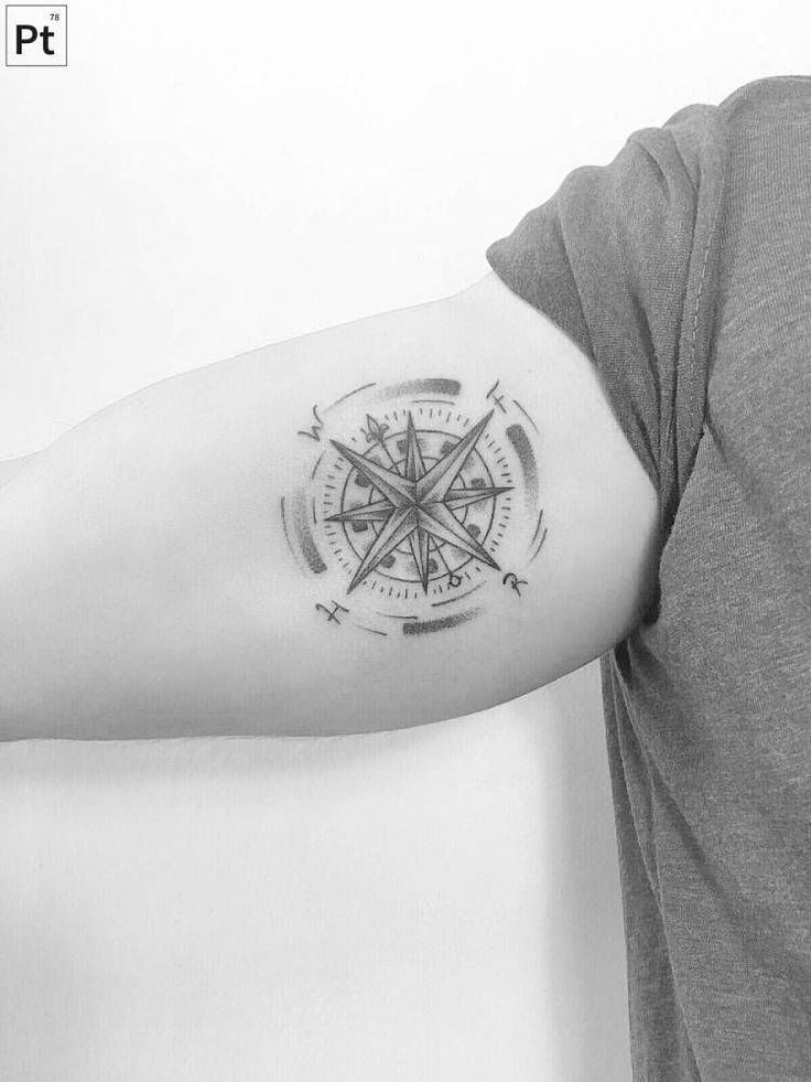
A compass paired with fine-line map contours is a popular symbolic bicep design representing direction, travel, or personal journey. The compass itself usually uses moderate line weight for the frame, with finer single-needle detailing for map lines or coordinates. A 3 to 5 inch placement on the outer bicep works well with the muscle’s natural curve framing the compass rose. Bring specific coordinates or a location reference if you want personalization — this is an easy way to make a common design idea genuinely yours instead of a copy-paste flash tattoo. Pain is moderate given the mix of bold and fine elements. This design suits both first-timers and guys adding to an existing arm collection. It also works nicely combined with script beneath it. Now let’s talk about a design many men choose for personal or spiritual reasons.
12. Religious Cross with Dotwork Shading
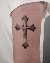
A cross combined with dotwork shading — remember, that’s the small-dot texture technique — creates depth and dimension without relying on solid black fill or color. Vertical placement down the bicep length, roughly 4 to 6 inches, suits the arm’s natural lines. Ask your artist about dot density gradients if you want a smoky, shadowed look around the cross rather than flat shading. Pain is moderate, with longer sessions due to dot placement time. This design carries personal or spiritual weight for a lot of guys, and it ages well since dotwork holds contrast better than thin gradient shading. It’s workplace-visible if worn short-sleeved, so consider that before committing to size and placement. For something with heavier mechanical detail, biomechanical designs are worth knowing about.
13. Biomechanical Blackwork Panel
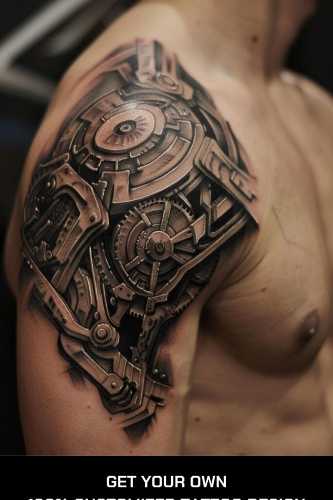
Biomechanical tattoos create the illusion of machinery or exposed structure beneath the skin, using heavy blackwork shading, sharp geometric edges, and sometimes negative space to suggest depth. This style demands a fairly large canvas — 5 inches minimum — to make the illusion convincing, which makes the bicep one of the better available spots on the arm. Look specifically for an artist with a blackwork-heavy portfolio and ask how they’d adapt the design to your arm’s natural muscle definition, since biomechanical work reads better when it follows anatomy. Pain runs on the higher end due to shading density and session length. This is a bold, high-commitment design, not typically recommended for first tattoos. For guys wanting nature themes instead, fine-line landscapes offer a gentler option.
14. Nature Scene Fine-Line Landscape
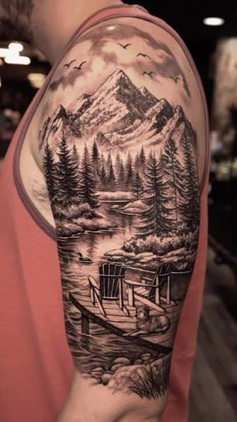
A mountain range, forest line, or wave pattern rendered in fine line creates a quiet, scenic design that wraps naturally around the bicep’s curve. Line weight stays thin and consistent, usually without shading, to keep the scene looking crisp rather than muddy. A 3 to 4 inch size fits most arms without crowding detail. Ask your artist about “single-pass” linework versus layered strokes, since single-pass tends to age cleaner on smaller nature scenes. Pain is generally low-to-moderate. This is a strong first-tattoo option and pairs well in matching sets for guys who hike, travel, or camp together. It’s also easy to keep workplace-appropriate given its subtlety. Rounding out the list, let’s look at a design that blends bold traditional elements with modern shading.
15. Skull and Roses Neo-Traditional
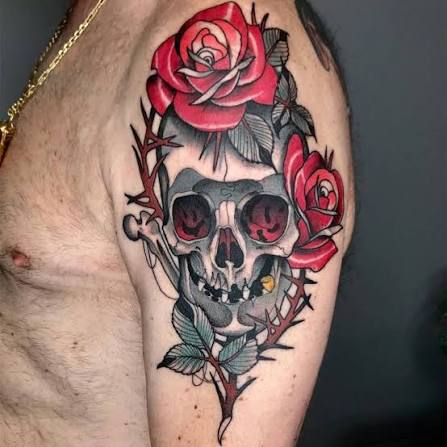
Neo-traditional tattooing takes the bold outlines of American traditional work and adds richer color saturation and more shading depth. A skull-and-roses bicep piece typically runs 4 to 6 inches, using thick black outlines with layered red, green, or purple shading in the petals. Ask your artist about their color-packing technique and how many healing sessions they recommend before final touch-ups, since neo-traditional color work often needs a follow-up appointment. Pain runs moderate-to-high given the shading and color density. This is a bold statement piece, better suited to guys already comfortable with visible ink rather than first-timers. It ages well thanks to thick outlines holding shape even as color mellows over the years.
Best Placement Ideas
- Outer bicep (most common): Balances visibility and moderate pain; good for most linework and blackwork styles.
- Inner bicep: More sensitive for some people, easier to conceal, works well for personal or private designs like script.
- Wraparound (full circumference): Best for bands, mandalas, and tribal patterns; requires more sitting time.
- Upper bicep near shoulder: Slightly more visible when wearing t-shirts; suits bold statement pieces.
- Lower bicep near elbow crease: More sensitive due to thinner skin; better for small, simple designs.
Tips for Success
Before booking anything, look through several artists’ portfolios and check specifically for consistency — are their line weights even across multiple pieces, or does quality vary? Ask to see healed photos, not just fresh ink, since fresh tattoos always look sharper than they will in a year. During your consultation, bring reference images, discuss size honestly (bigger is often better for detail retention), and ask direct questions about needle configuration, ink brand, and how they handle touch-ups. A good artist will talk you out of a design that won’t age well rather than just taking the booking.
Common Mistakes and How to Avoid Them
- Going too small for detailed designs: Fine detail needs enough surface area or it blurs within a few years.
- Ignoring how the bicep curves: A design meant for flat skin can distort when wrapped around muscle.
- Skipping aftercare instructions: Poor healing affects how sharp lines stay long-term.
- Copying a design exactly from social media: Personalizing even slightly avoids an identical tattoo to hundreds of others.
- Choosing a stylist based on price alone: Cheaper work often means less experience with technique-specific styles like dotwork or realism.
Similar Variations
Most of these designs can be resized smaller for a subtler statement, extended into a half-sleeve for more coverage, or recolored — for instance, turning a black-and-grey realistic portrait into a muted color version. Combining ideas also works well: a compass paired with a nature scene, or a script quote wrapped beneath a blackwork band. Talk to your artist about custom design options rather than picking flash tattoo work straight off a wall if you want something that reads as personally yours.
Aftercare Basics
General aftercare guidance includes keeping the tattoo clean, avoiding direct sun exposure during healing, not picking at peeling skin, and avoiding swimming pools or soaking until fully healed. Healing time for most bicep tattoos runs 2 to 4 weeks on the surface, though full settling underneath can take longer. Always follow the specific aftercare sheet your artist gives you, and reach out to them or a licensed dermatologist if you notice unusual redness, swelling, or irritation that doesn’t improve.
Quick FAQ
How much does a bicep tattoo cost?
Cost varies widely by size, detail, and artist experience, but simple fine-line designs often start around $80–$150, while larger blackwork or realism pieces can run $300–$800 or more.
How painful is a bicep tattoo?
Most people describe it as moderate, since the area has muscle and some padding, though pain tolerance differs person to person and placement (inner vs. outer bicep) matters too.
How long does a bicep tattoo take to heal?
Surface healing typically takes 2 to 4 weeks, with full healing underneath sometimes taking a couple months, depending on aftercare and individual skin.
Will a bicep tattoo fade quickly?
Solid black and bold outlines tend to hold up better over time than fine lines or color-heavy shading, which may need touch-ups sooner depending on sun exposure and skin type.
Final Thoughts
Picking from these bicep tattoo men designs really comes down to matching the technique to your lifestyle — how visible you want it, how much time you’re willing to spend in the chair, and how it’ll look not just today but ten years from now. Talk openly with a licensed, experienced artist, ask the technical questions, and don’t rush the decision just to get it done. The right bicep tattoo for men isn’t about finding the trendiest image online; it’s about picking a design and technique that’ll actually hold up on your skin, in your life, for years to come.